Napkin AI envisions a future where visual communication is seamlessly accessible to all, transforming how ideas are conveyed across every industry. By harnessing the power of advanced generative AI, we are creating a world where text can be instantly translated into compelling visuals that make complex information clear, engaging, and impactful.
Our mission is to dismantle the barriers of traditional communication by integrating AI-driven visual storytelling into everyday workflows. We are pioneering a new category – Visual AI – that empowers individuals and organizations to communicate with clarity and creativity, regardless of design expertise.
Through continuous innovation and deep understanding of human communication, Napkin AI is building a future where the power of visuals enhances every story, decision, and message, making information not just seen but truly understood.
Our Review
We've been testing Napkin AI for the past few weeks, and honestly? It feels like someone finally cracked the code on one of work's most annoying problems. You know that moment when you're staring at a wall of text in a document, thinking "this would be so much clearer as a diagram" — but then you remember you're not a designer and move on? Napkin AI basically eliminates that frustration entirely.
The Magic Moment
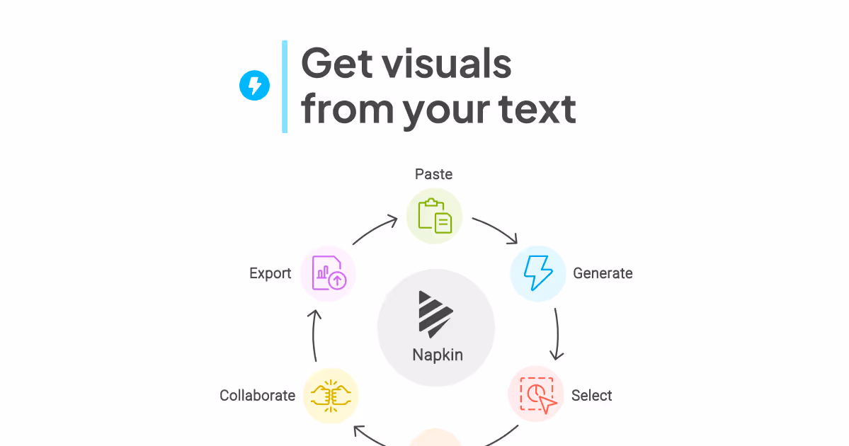
Here's what impressed us most: you literally just paste your text, and within seconds, you get a polished visual that actually makes sense. We threw everything at it — project timelines, process flows, even some messy brainstorming notes — and consistently got back clean, professional-looking diagrams and infographics.
The AI doesn't just slap your text into generic templates either. It seems to understand context and picks appropriate visual styles. A workflow becomes a flowchart, a comparison turns into a side-by-side layout, and lists transform into organized mind maps.
Where It Really Shines
The editing capabilities surprised us. Sure, AI-generated visuals are cool, but being able to tweak colors, swap icons, and adjust layouts means you're not stuck with whatever the algorithm spits out. It strikes that sweet spot between automation and control.
Integration is another win. We tested it with Google Docs and PowerPoint, and the workflow feels natural — no jumping between apps or wrestling with file formats. The export options (.ppt, .png, .pdf, .svg) cover pretty much any scenario you'd encounter.
Who Should Care
This tool makes the most sense for professionals who regularly create presentations, reports, or any content where visuals would help but design skills are lacking. Content creators, educators, and consultants will probably find it invaluable.
We're particularly excited about the potential for teams that produce a lot of documentation. Instead of dense text blocks that nobody reads, you could have engaging visuals that actually communicate your ideas. That $10 million seed funding from Accel and CRV suddenly makes a lot more sense when you see the broader vision here.
Feature
Converts text content directly into relevant visuals
Fully editable visual elements including icons, connectors, colors, fonts, and decorators
Seamlessly integrates with Google Docs, Slides, Canva, Slack, Word, PowerPoint, email, and more
Outputs exportable as .ppt, .png, .pdf, or .svg files
Enables creation of presentations, blog visuals, social media content, and easy-to-read documents
FAQs

Napkin AI